Discovery filtering & community ratings
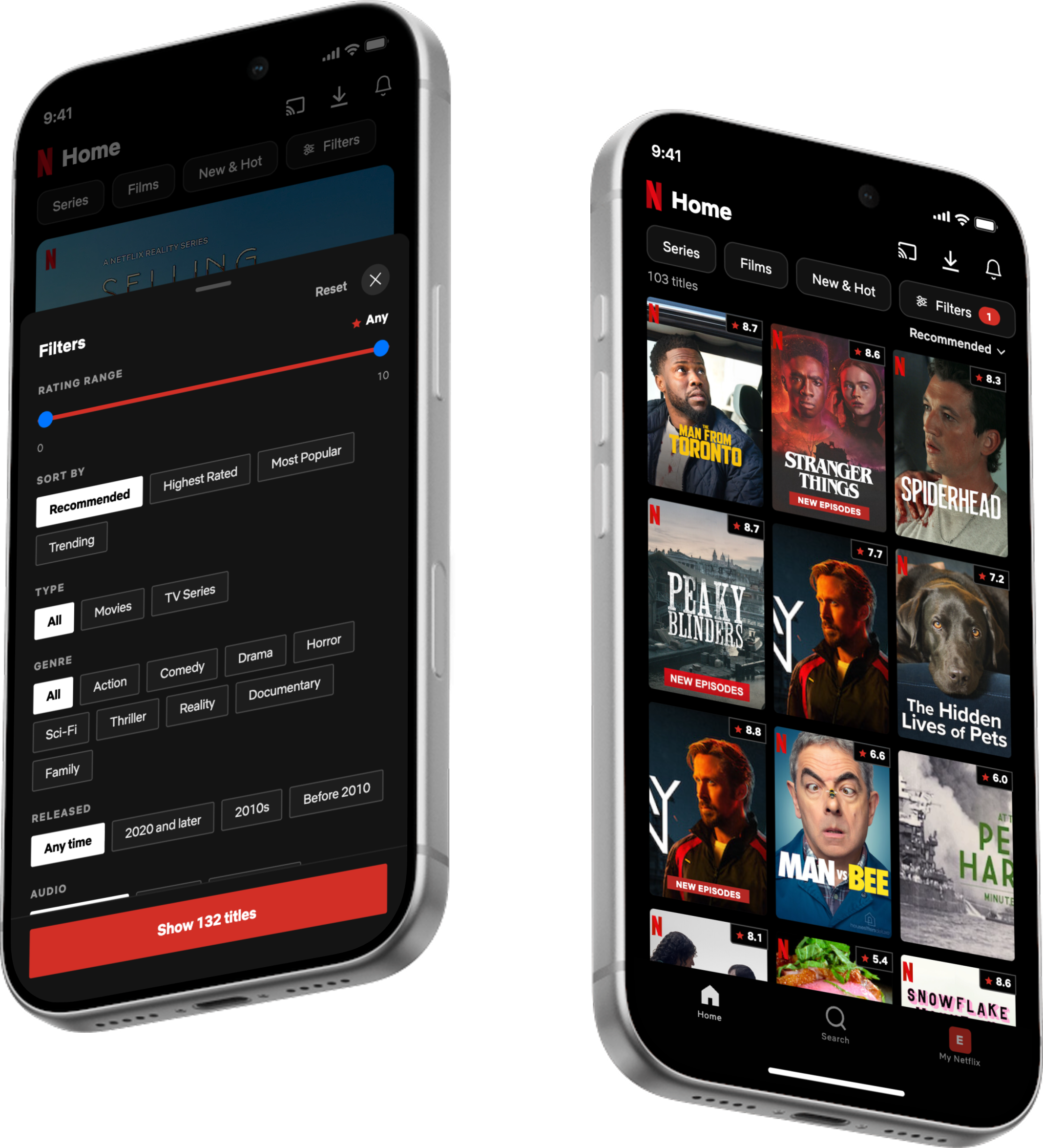
A quality signal for the Netflix mobile app: a trustworthy 1.0 to 10.0 community score on every title, filterable and combinable with the filters Netflix already has.
- Role
- UX Research, UX/UI Design, Prototyping
- Timeline
- 2026
- Team
- Solo
- Platform
- iOS, mobile
- Impact
- 60% would adopt at launch
Overview
I set out to add IMDb-style ratings to Netflix, then learned why Netflix removed them on purpose, and designed a version it could actually ship: a native community score on every title, filterable in place. A solo concept, grounded in a 10-person survey and a 10-person usability test.
Problem
Netflix shows no objective quality signal, so people leave the app to judge whether a title is good elsewhere. Deciding what to watch turns slow and stressful, and some give up and watch nothing.
Solution
A Netflix-native 1.0 to 10.0 community score on every title, plus a rating filter that combines with the filters Netflix already has. People can judge quality and decide faster, without leaving the app.
Five steps, from a hunch to a tested prototype.
- 1
Framing
- 2
Validation
- 3
Design System
- 4
Ideate
- 5
Prototype & Testing
- 1
Framing
- 2
Validation
- 3
Design System
- 4
Ideate
- 5
Prototype & Testing
I thought Netflix was missing something obvious.
Every time I opened Netflix I did the same thing: find something that looked interesting, then leave the app to check whether it was actually good. My hypothesis was simple: Netflix has no objective quality rating, and that makes deciding what to watch slow and stressful.
The fix looked easy: just put IMDb-style ratings on Netflix. A hard look at the research and the business turned that assumption inside out.
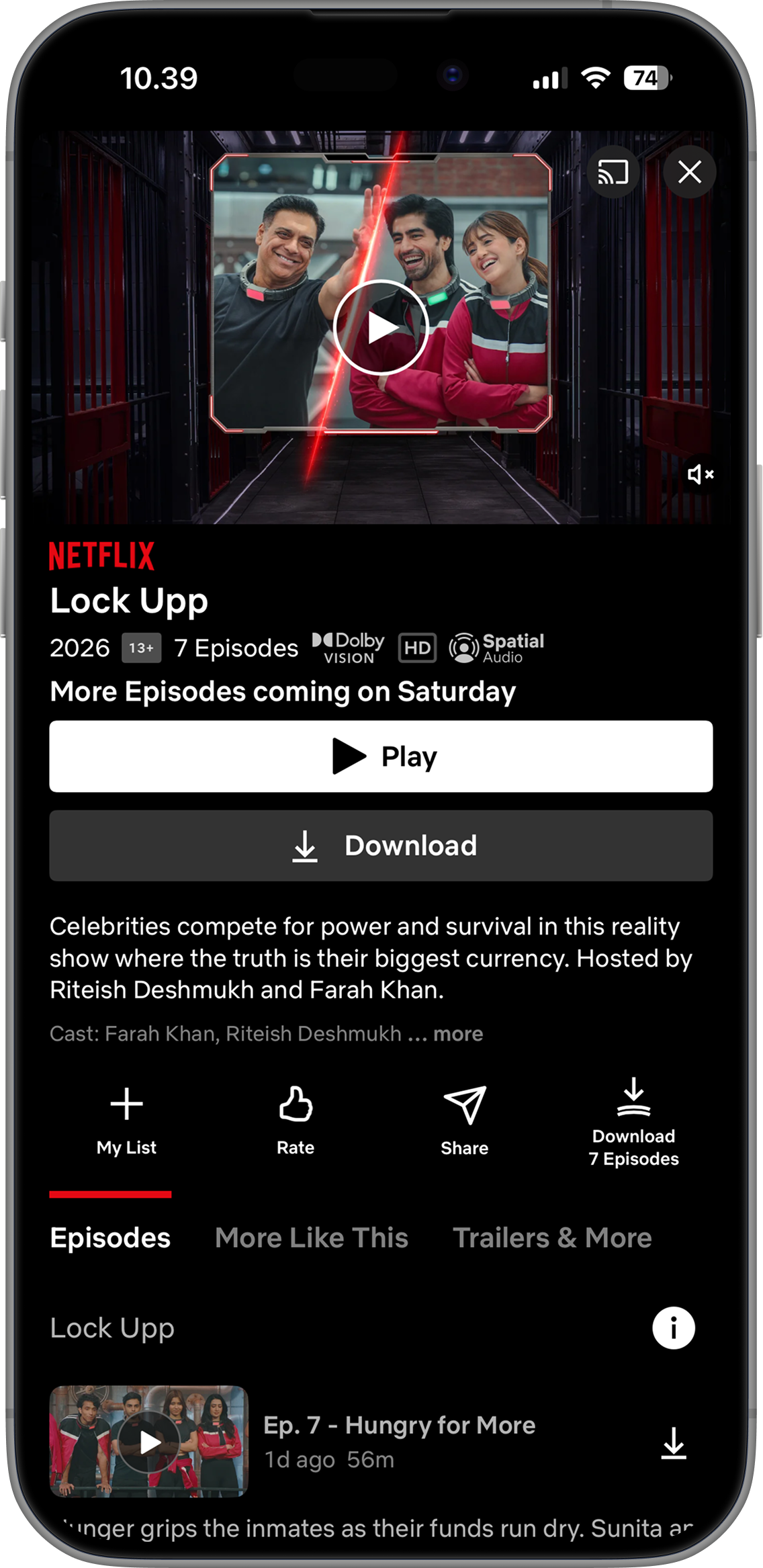
- Thumbs and Top 10 hint at popularity, never "is this good?"
- So people leave the app, or give up and watch nothing.
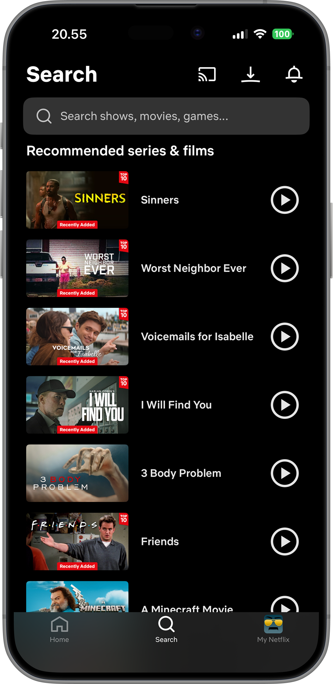
A whole list Netflix picked for you, with no reason why any of it is here, or whether it is good.
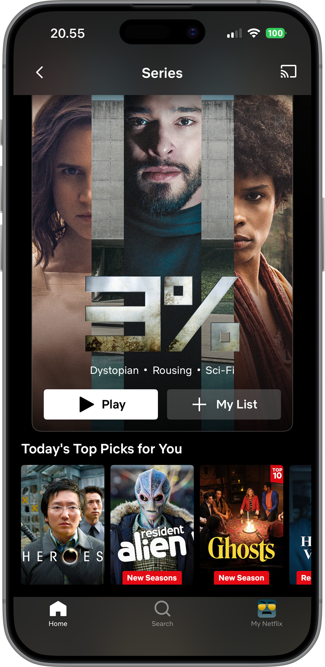
"Top picks" and "Top 10" signal popularity, never quality. Still nothing to decide with.
But was this everyone's problem, or just my habit? Before designing anything, I needed evidence.
Was this a real problem, or just my habit?
I ran one unmoderated study with 10 regular Netflix users, to hear how people actually decide what to watch before pressing play.
An unmoderated survey on Maze, "Deciding what to watch on Netflix."
- 10 participants, 17 blocks, all completed.
- Behaviour and open questions came first, the idea revealed only after, to avoid priming.
- Participants were English-speaking adults aged 25 to 44 from the UK and US, all regular Netflix users.
8 / 10
struggle to decide what to watch
6 of them often
6 / 10
spend 5 minutes or more deciding
3 spend over 10 minutes
8 / 10
have given up and watched nothing
9 / 10
check ratings outside Netflix first
IMDb, Letterboxd, Google
1 = do not trust, 5 = trust completely
No one fully trusts them, and the average sits just below neutral.
The signals people trust live on rivals' turf, IMDb most of all.
"There's too much filler content being presented as good or even okay content."
"...go on Letterboxd to look at rating or reviews."
"they push certain titles... rather than what you'll like."
"so many mid options and so very few top end options."
"read the description and let the short trailer play."
How might we help viewers judge whether a title is worth their time, without leaving Netflix, using a signal Netflix would actually ship?
An established UI kit, wired through AI into finished product screens.
To accelerate the design process, I integrated the Netflix Mobile UI Kit from the Figma Community into my AI-assisted workflow. Rather than creating a design system from scratch, I used an established component library to ensure visual consistency while rapidly generating and refining product screens with Claude Design and Claude Code.
Figma UI Kit
Netflix's own components
Claude Design
System as source of truth
Claude Code
Screens built in React
Figma Community UI Kit
Design systemThe Netflix Mobile iOS UI Kit from the Figma Community: colours, typography, components, and full screen templates, all in Netflix's own visual language.
Claude Design
I brought the kit into Claude Design as a working design system: brand and colour tokens, components, icons, navigation, spacing, and type.
Claude Code
From that system I generated and refined the product screens as real React and Tailwind components, iterating on layout, copy, and states directly in code.
The screens, and the calls behind them.
Each screen resolved a specific decision. One rule sat behind all of them: the score had to be Netflix-native, not a borrowed IMDb number, since Amazon owns IMDb.
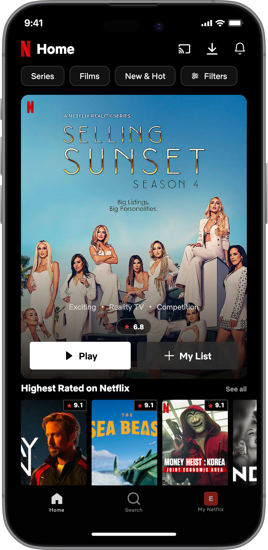
The rating lives on the card
Screen space is tight, so I put the rating right on the card, on the hero and on every poster. You see how good a title is while scanning, without scrolling down or opening it.
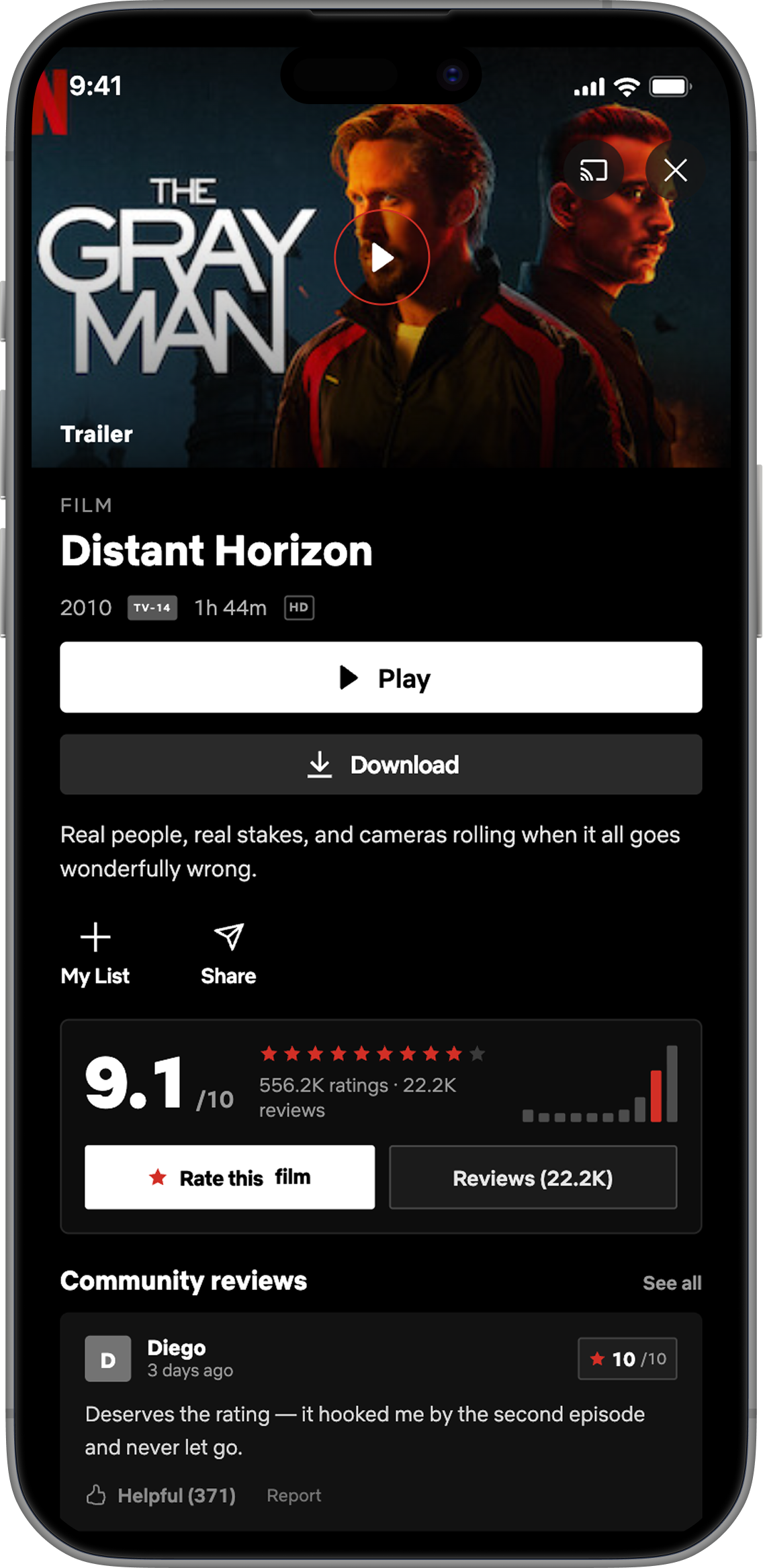
Resolve the doubt in place
Score, rating volume and a distribution histogram sit together above the reviews, so the signal stays local to the title. Keeping the box below Play means the rating never pulls focus from the main action at the top. The trip out to IMDb never has to happen.
From buttons to a slider
My first pass used fixed preset buttons, but they only offered a handful of thresholds, with no way to set a precise minimum or a range. A slider solved both, and the apply button counts the matching titles live as you drag.
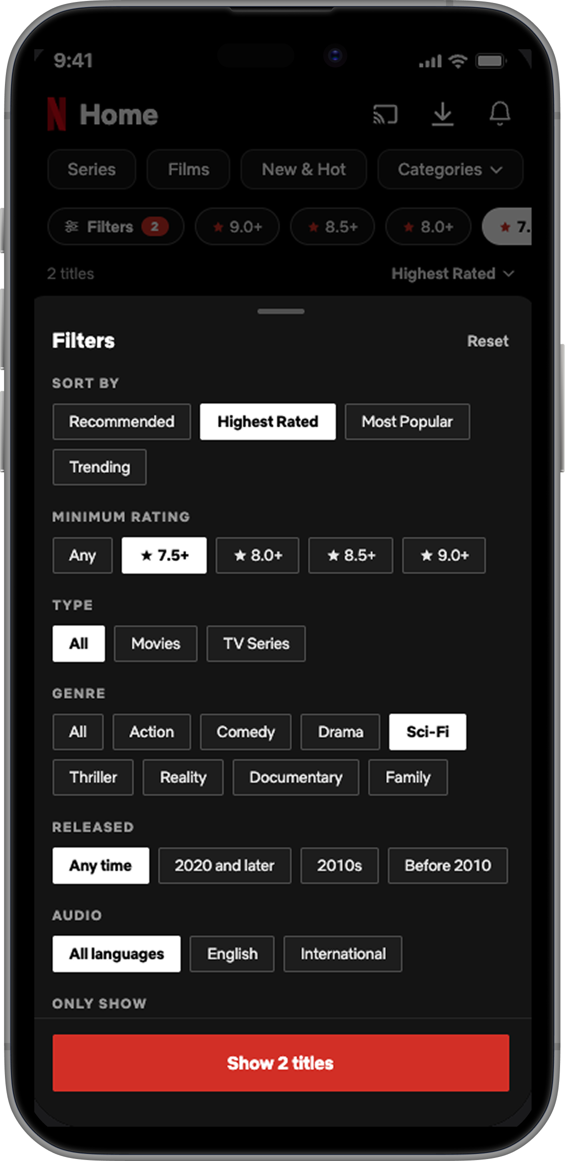
Preset buttons like 8+ or 9+. Only a few fixed thresholds, and no way to set a precise minimum.
A slider sets any exact minimum, with the apply button counting matching titles live.
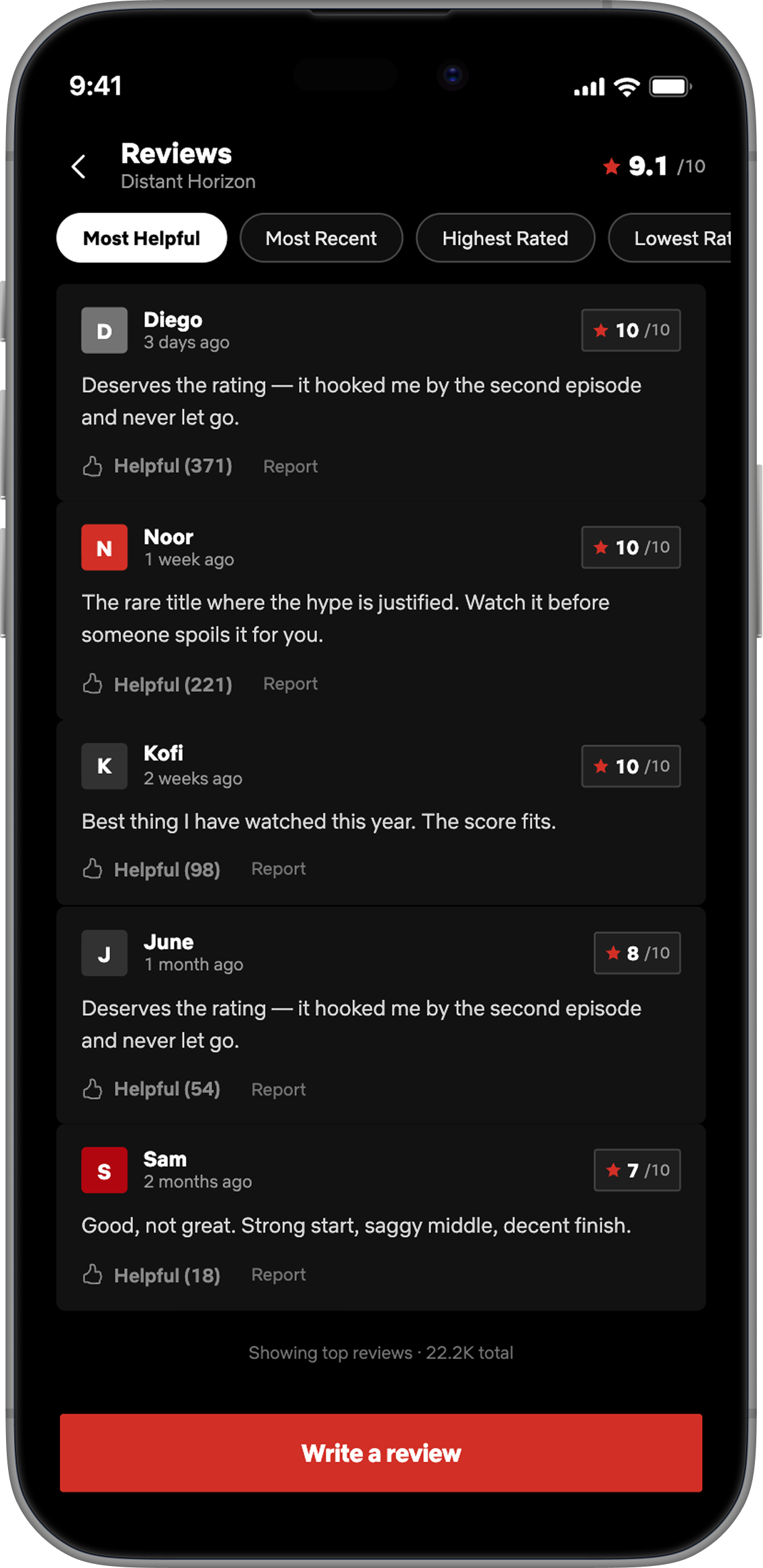
Reviews you can trust
The reviews are what make a native score feel human rather than algorithmic.
All reviews
- Sort by most helpful, recent, or rating without leaving the app.
- Every review carries its own score, so the number has a face behind it.
- Helpful votes float the signal up; Report keeps abuse in check.
- The full review count sits under the score, not an opaque model.
Giving rating and review
- Your rating posts under your name, and reviews are moderated.
- Tap the stars to set a score; a label names it, like "8, Great".
- The written review is optional. A rating on its own still counts.
- One tap posts the rating and review together.
I tested it with 10 people. Finding a rating works; getting them to leave one is the risk.
An unmoderated usability test on Maze put the clickable prototype in front of 10 regular Netflix users, across four tasks: pick something to watch, find its rating, filter a genre by rating, and leave a rating and review. The consumption side held up. The contribution side is where the honest problem showed.
Browse and pick something to watch
3.9 / 5
confident in the pick
Find its rating
100%
found the rating
Filter thrillers rated 8.0+
90%
filtered correctly
Leave a rating and a review
90%
left both
1 = not confident, 5 = very confident
Most felt good about their pick, but few were fully sure. That residual doubt is exactly the gap a visible rating is meant to close.
Eight of ten read it as a native, viewer-driven score, not critics and not the % Match algorithm. The signal landed as intended, though three were unsure.
Try the live build. This is the exact prototype the 10 participants used.
Finding and filtering by a rating tested easily. Asking people to leave one did not fail on usability, it failed on motivation: leaving a review scored 5 / 5 for ease, yet 4 of 10 said they still would not do it.
The split is not about the UI. Every yes is about reading other people's ratings; every no is about being the one to write them.
"Maybe show a screen asking for a review at the end of watching a show?"
- "It would give us ideas about what we should watch."
- "It would help other users decide what is worth watching."
- "Yes, they seemed like made for real people who watched the series."
- "No, no incentive to review and rate shows."
- "I don't really care to write out reviews. The most I'll do is click the thumbs up icon."
- "I would not. I just usually forget to do it or I don't want to."
If this shipped, here is what I would expect to move.
Two hypotheses to validate after launch, not measured results, each tied to something the test actually showed. The third is the one figure the study did measure.
Filtering a genre by rating replaces open-ended scrolling. That task tested at 5 / 5 for ease.
The consumption side held up. Every yes in testing was about reading other people's ratings to decide faster.
The one figure the study measured: 6 of 10 participants said they would use these features.
What I got wrong, and what comes next.
What surprised me
The hard part was never the UI. Netflix removed ratings on purpose, so the real design problem was a quality signal that helps viewers and that Netflix would still want to ship.
The assumption I still have to kill or confirm
Not whether people struggle to decide: the survey settled that, 8 of 10 do and 9 of 10 leave the app to check ratings. The open one is participation. Usability showed people happily read a rating but many would not leave one, so the real risk is getting enough ratings to make the score credible.
Would Netflix actually ship it?
A visible quality score threatens weak originals. But framed as engagement-positive, people commit faster and abandon the browse less, it lines up with watch-time rather than against it. That is the argument I would take to a PM.
- Re-run the usability test on mobile with a larger sample: this round was 10 people on desktop, and the feature is designed mobile-first.
- Complete the competitive teardown (Prime Video, JustWatch, Letterboxd) to place the pattern precisely.
- Act on what the usability round surfaced: close the contribution gap with a prompt at the end of a title, and tighten the "highest rated" preset so a sub-8.0 result never slips through.
- Iterate on cold-start and participation, the two things most likely to break the score's credibility.
Design concept. Not affiliated with Netflix.
A quality signal Netflix could plausibly ship, and that helps you decide faster.