Helping Solo Travelers Find Compatible Travel Companions
Designing a better and more intuitive way for travelers to find, evaluate, and connect with potential travel partners.

Travel solo?
Not anymore.
Plenty of others want the same thing you do: someone to share the journey with.
Already have an account? Sign in
- Role
- UX Research, UX/UI Design, Prototyping
- Timeline
- 2026
- Team
- Solo
- Platform
- iOS, mobile
- Impact
- 80% expect it to make matching easier
Overview
TravelBuddy is a travel-companion discovery app that helps solo travellers find and connect with compatible partners based on destination, travel dates and personal preferences. Designed solo and grounded in a 10-person survey and a 10-person usability test.
Problem
This started as my own problem. In summer 2026 I had no one to travel with, so I set out to see whether other solo travellers faced the same thing. They did.
Finding a travel companion is surprisingly difficult. The tools people fall back on, like Facebook groups and forums, bury the details that decide a good match: destination, travel dates, age and preferences are often unclear.
Solution
A discovery app where solo travellers find trips with like-minded people that fit their criteria, with the deciding details surfaced up front: destination, travel dates, age range and traveller preferences. Verified profiles add trust.
With those details visible at a glance, people can size up a trip and its host faster, and spend less time on ones that were never going to fit.
The end-to-end process I follow: frame the problem, design and validate a prototype, then iterate from testing into a final design.
Design first, then validate.
- 1
Framing
- 2
Initial Design
- 3
Survey
- 4
Iteration
- 5
Usability Testing
- 6
Iteration
- 7
Final UI Design
- 1
Framing
- 2
Initial Design
- 3
Survey
- 4
Iteration
- 5
Usability Testing
- 6
Iteration
- 7
Final UI Design
Turning the problem into a clear opportunity.
How it works today
Search forums
Reddit, Facebook groups, travel boards
Post a request
Trip, dates, and hope someone replies
Wait for replies
Answers trickle in over days
Vet by hand
No way to confirm anyone is real
Risk it or give up
Most threads go nowhere
Every step depends on trust you cannot check and effort that rarely pays off.
What that adds up to
Compatibility is scattered
NeedSee the deciding details in one place.
Identity is unverified
NeedA clear signal the person is real.
Time is wasted
NeedScreen for fit before investing in a conversation.
The opportunity
How might we help solo travellers surface compatibility at a glance, so they spend less time chasing matches that were never going to work?
Wireframing the core flows around compatibility and filtering.
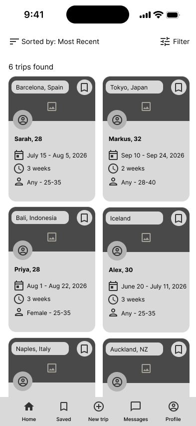
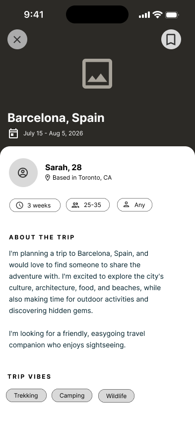
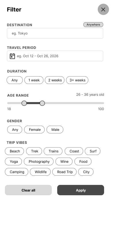
Two decisions came straight out of the framing
A discovery feed for quick screening
Cards lead with destination, travel period, trip length, gender and age preference, so a trip can be judged at a glance. Those are the details that decide a match, so they sit up front.
A filter with the same parameters
Rather than scroll, users narrow by destination, dates, duration and age, the same parameters that decide a match.
Pressure-testing the concept with 10 travellers on Maze.
I ran a 10-person survey on the Maze panel, with ten blocks covering how people find companions today, where it breaks down, and how they'd react to the concept. It confirmed the filters I'd built around, and surfaced one thing I'd underweighted.
Most valuable features to respondents
Trust was the loudest signal
Open question
What would be your biggest concern about using an app like this?
Finding people with a similar outlook in life and not looking to engage in crime or take advantage of me
That the people using it wouldn't be fully vetted. I wouldn't want to travel somewhere expecting to meet up with a someone and end up being met with a catfish, that wouldn't be safe.
That the person is not vetted enough and may be dangerous
Building verification in after trust topped the research.
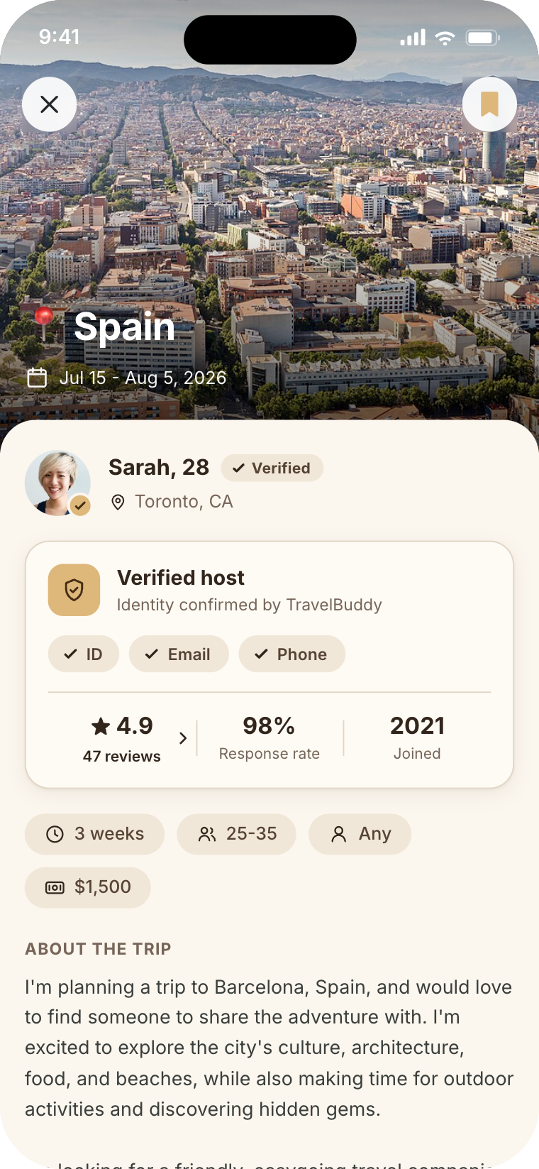
Trust was in my problem statement, but the initial design underbuilt for it. The survey made the priority unmistakable. So verification became a first-class part of the trip screen. Same screen, before and after:
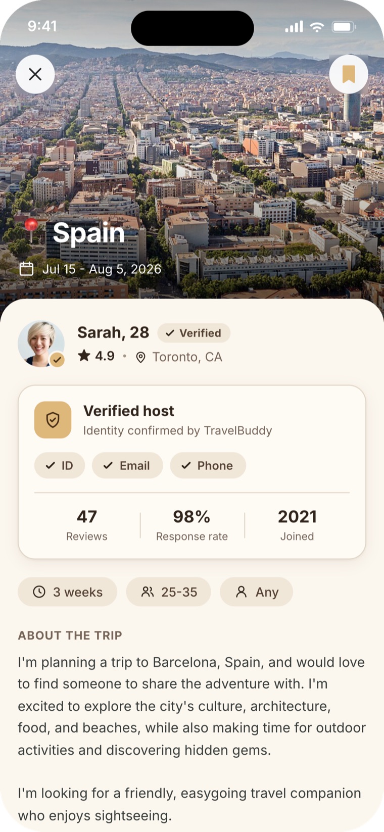
Before
- Just a name and bio, with no way to judge if they're real.
- No verification, ratings or track record.
After
- Verified badge: identity confirmed.
- Verified-host card: ID, email & phone confirmed by TravelBuddy.
- Ratings, reviews & response rate add a track record.
Testing the final screens with 10 users on two tasks.
An unmoderated usability test on Maze: 10 participants, two core tasks (find & contact a companion, and create a trip).
Try the live build right here.
4.3/5
Ease of finding a companion
4.1/5
Trust from verification badges
4.1/5
Ease of creating a trip
50%
Completed the find-a-match task
40%
Completed the create-a-trip task
50%
Would use the app (40% no, 10% maybe)
I wish this existed! This is something I would personally use.
I could find matches and create my own trips with a minimal number of clicks.
What wasn't clear or didn't work, and what's next.
Two things tripped testers up. These are the gaps I'd close before the next round of testing.
- 01To fix
Reviews were out of reach
Testers trusted the verified badge but went looking for ratings and reviews and couldn't get to them. Add reviews, with a clear button to open them.
- 02To fix
No sense of cost
People expected a budget to judge affordability, including flights and accommodation, and there was nowhere to show it.
Reworking the screens from what the usability test surfaced.
The test surfaced that reviews were out of reach and there was no sense of cost. I reworked the reviews entry point across two versions, from a first attempt that fought the layout to the version I landed on, which also adds the budget testers asked for.
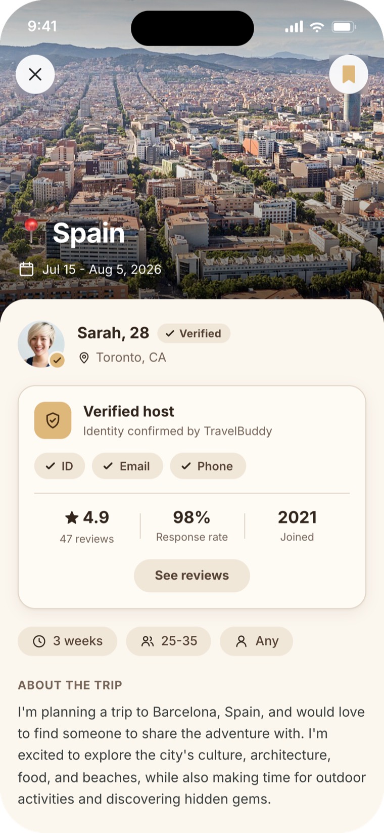
Version 1
- A standalone 'See reviews' button didn't fit the design.
- It pulled attention from the primary 'Send message' button at the bottom of the screen.
Version 2
- The verified-host card stays the focus: the change leaves the screen's hierarchy intact.
- Highlighted reviews and a chevron mark the row as a clickable button.
- A budget pill was added so travellers can gauge the trip's budget at a glance.
The build the process landed on: compatibility and trust up front.
The final build pulls it together: compatibility up front on every trip card, with the verification that the iteration added for trust. These are the core screens.
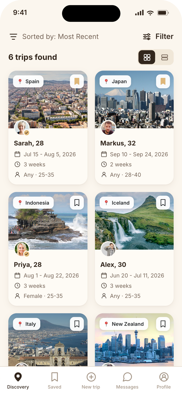
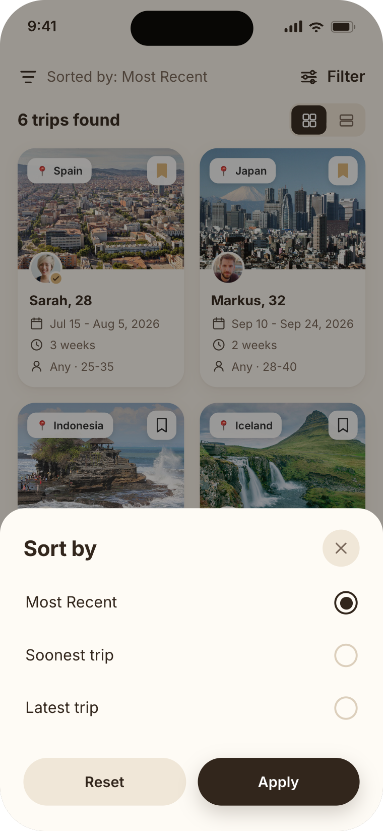
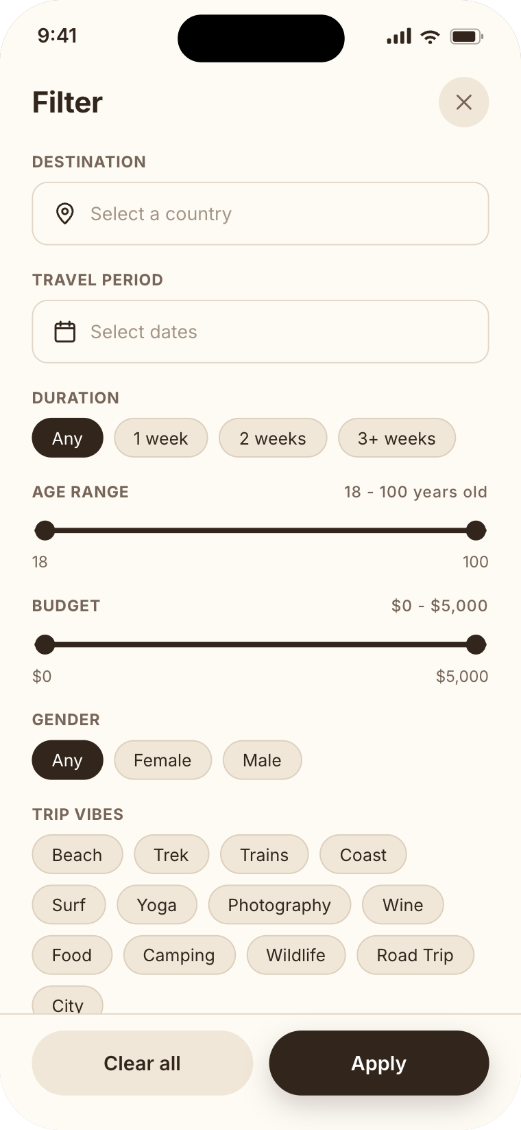
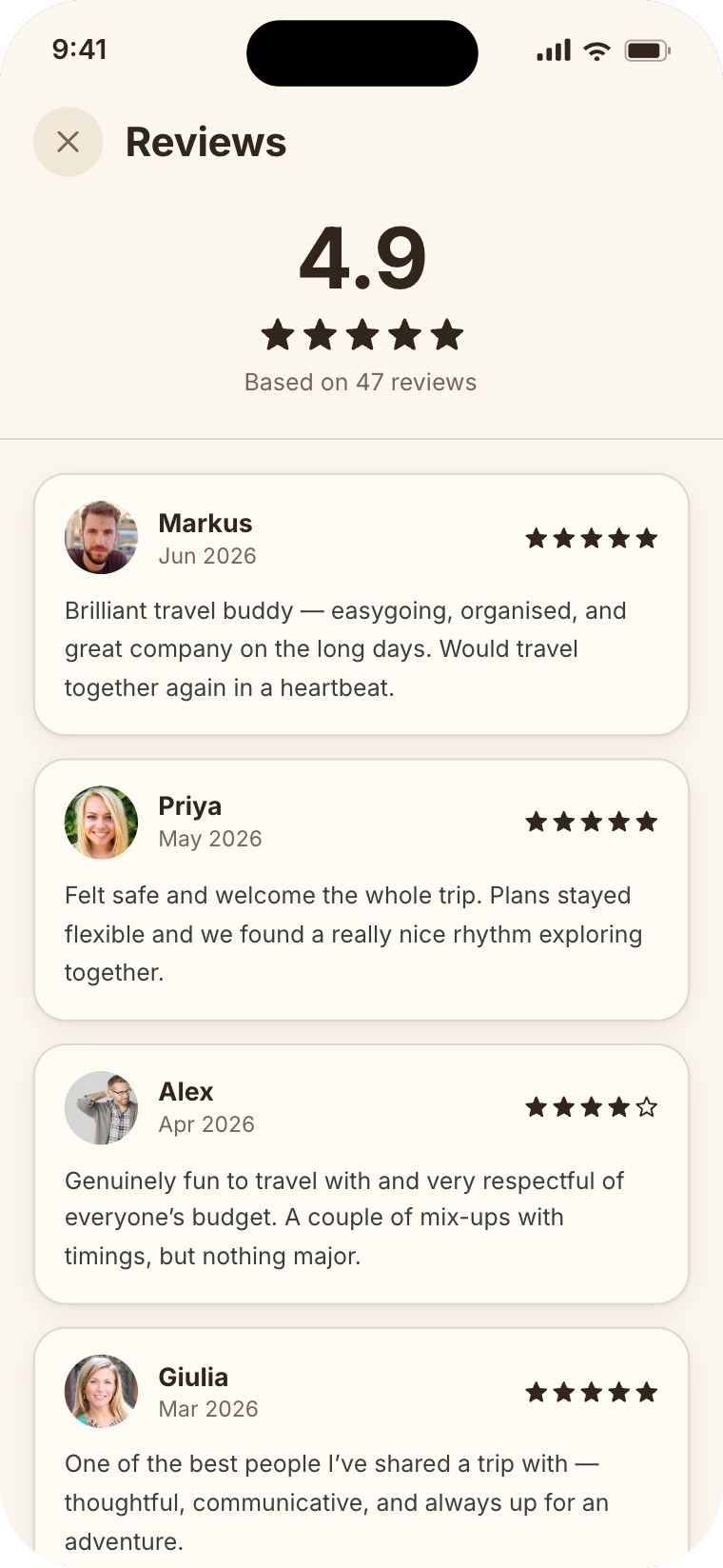
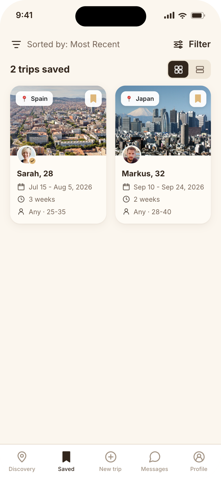
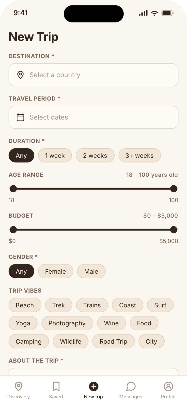
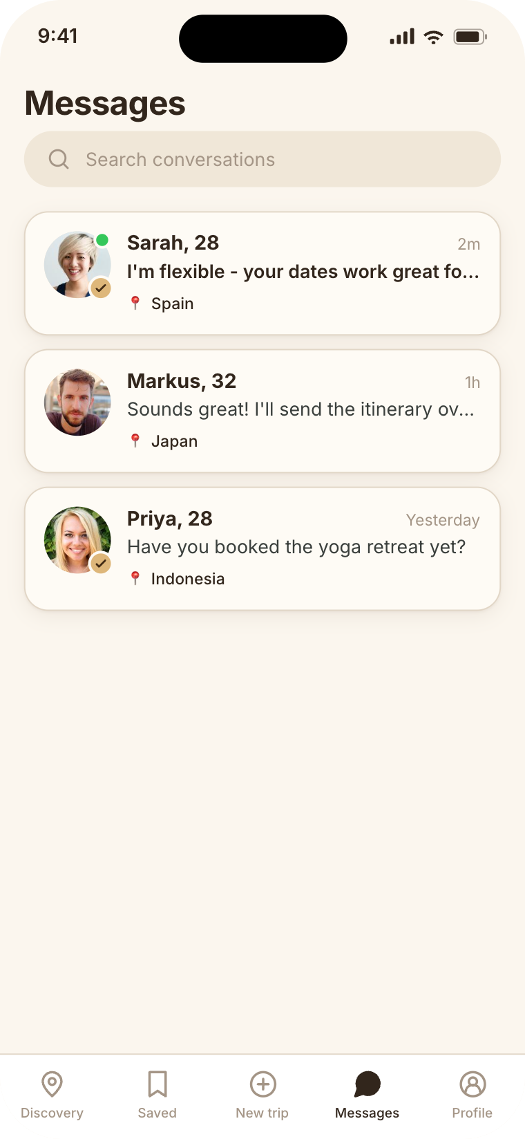
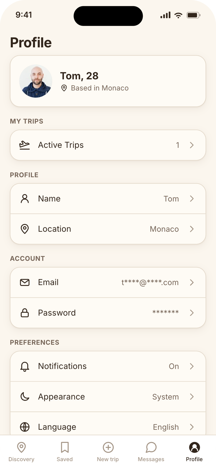
Tied back to the problem: the buried, unverified details that made matching hard are now up front and trust-backed. Two rounds of research say the direction is wanted, with honest gaps still to close.
A direction users wanted, and could use.
The work moved the details that decide a match, destination, dates, age and preferences, from buried in forums to up front on every trip card, with verified profiles for trust. Two rounds of research, a concept survey and a usability test, back the direction.
Five compatibility details up front on every trip card, judged at a glance.
4.3/5
ease of finding a companion in testing (usability test)
Compatibility surfaced and filterable, instead of buried in forum posts.
80%
said the concept would make finding a companion much or significantly easier, none said it wouldn't help (survey)
Verified-profile badges, the safeguard testers asked for most.
4.1/5
trust from verification in testing, no tester rated it below neutral (usability test)
What the research did not settle: only half the testers said they would use it (50% yes, 40% no, 10% maybe), and several of the "no" answers came from people who already travel with friends or a partner, not from the app falling short. The create-a-trip flow is the clearest gap, finished by 40%, and sits at the top of the next-round backlog.
I wish this existed! This is something I would personally use.
I could find matches and create my own trips with a minimal number of clicks.
It can match with people who have similar interests, age, budget and travel style, making it easier and faster to find the right travel partner.
What I learned, and what I'd change.
What I learned
Prioritise for a small screen
Phone space is scarce, so I had to choose what's critical enough to show early. Compatibility details earned a spot on the discovery card; the rest moved to the detailed trip screen.
Research, or you design blind
Without it you build on your own preferences, not the user's. Research is what kept the decisions grounded in real needs.
Document the thinking as you go
The parts I thought were unimportant, the options I weighed and why, turned out to be the best way to show how I think.
What I'd do differently next time
Prototype in code sooner
Instead of long stints in Figma, I'd spin up a repo and build a working prototype with Claude Code. It taught me far more about interactions, modals and error states than static screens could.
Research before deciding
I'd run research earlier, before locking in design decisions, so the first direction is informed rather than corrected later.
Plan the research method upfront
I'd prepare sharper methods and questions in advance, so the insights that come back are genuinely useful.
Thanks for reading.
I'd love to walk you through the rest in person.